flowX
Branding / Corporate Design
About this Project
A research project pioneering the first active thermal glass facade system for managing energy flows. The task: develop a complete corporate design from scratch that unites technology, innovation, and sustainability. The result is a brand identity that reflects both cutting-edge engineering and environmental consciousness.
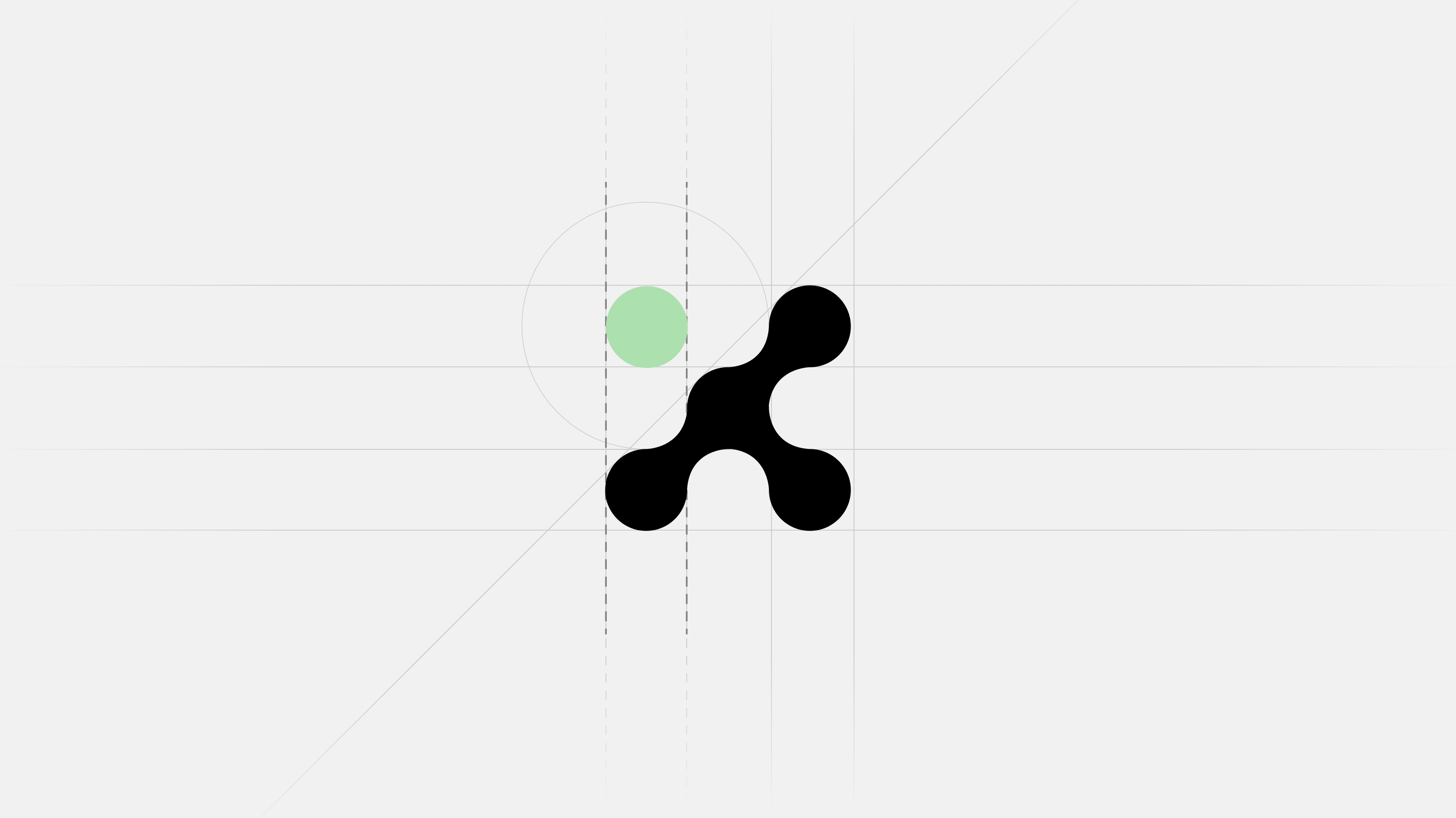
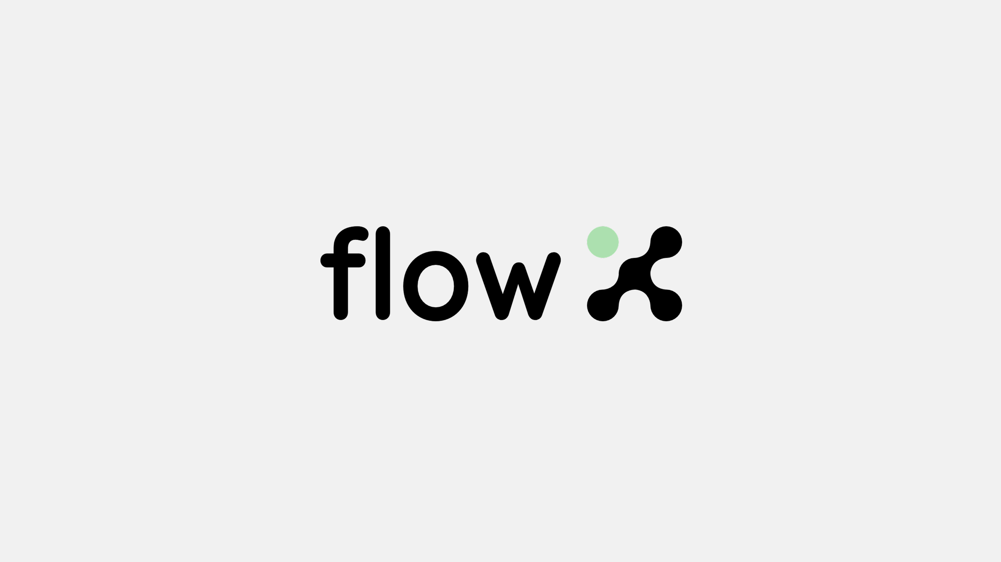
Four dots form an X and symbolize the four functions of the facade: cooling, heating, thermal insulation and energy storage. The green dot emphasizes the sustainability of the symbol. The logo thus illustrates how the technology works. The minimalist design is applicable to all media and is durable.
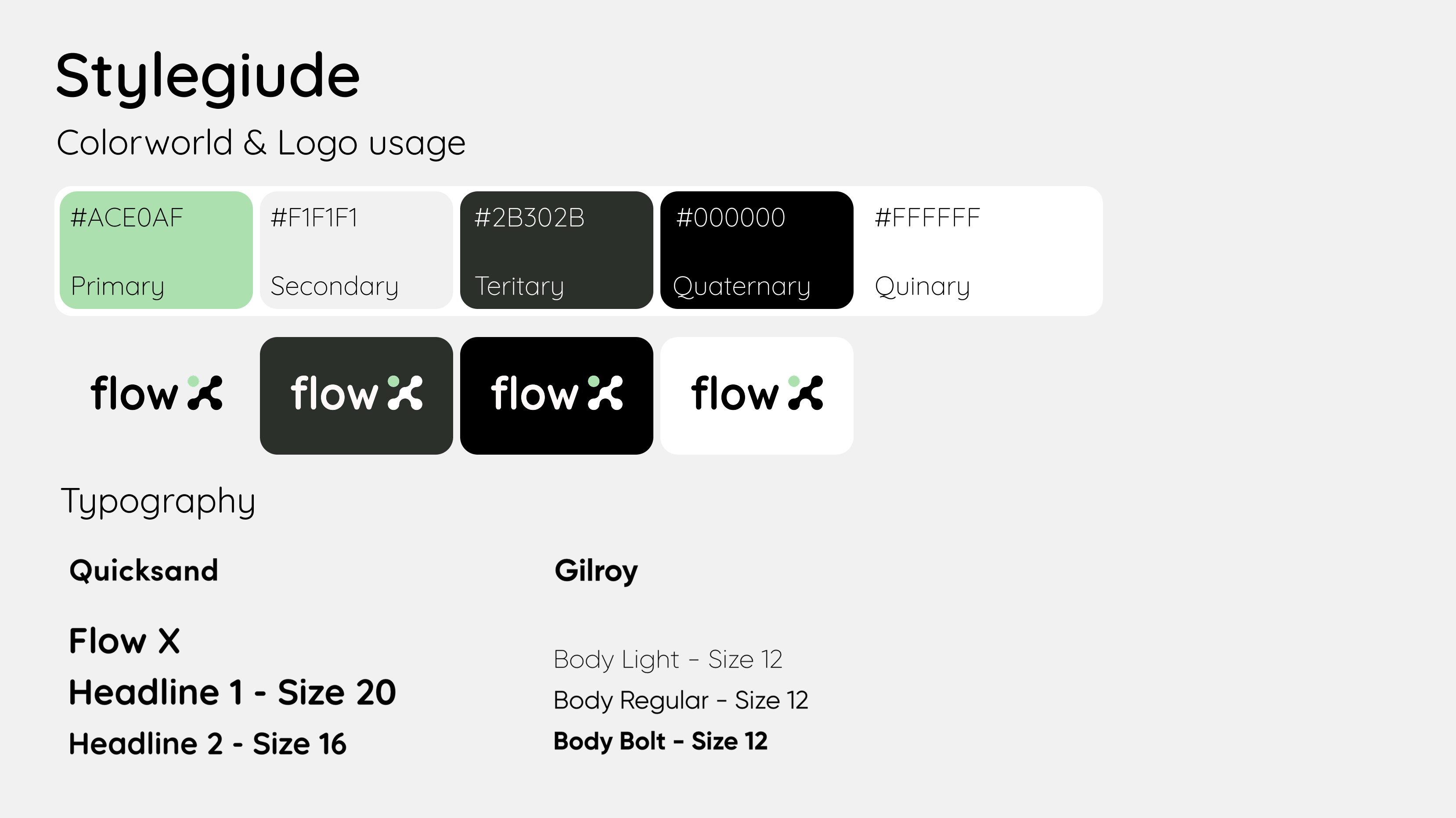
Strategic color choices define the brand: green signals sustainability, while bold contrasts - black against white - emphasize innovation and clarity. Sans-serif typography keeps the focus on technology. The visual language unites environmental responsibility with scientific precision.
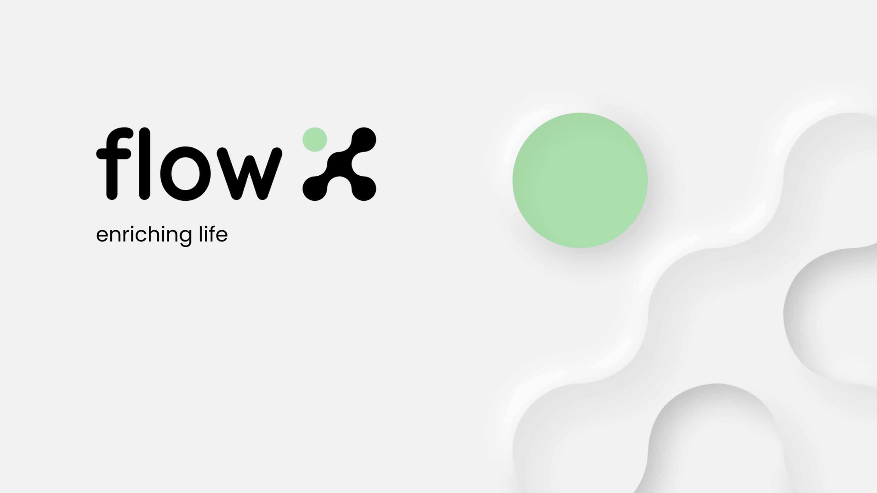
Neumorphism defines the visual style - giving the brand a modern, tactile feel. This design approach reinforces the smart home concept, making advanced technology feel accessible and integrated. Soft shadows and highlights create a welcoming aesthetic that balances innovation with everyday usability.
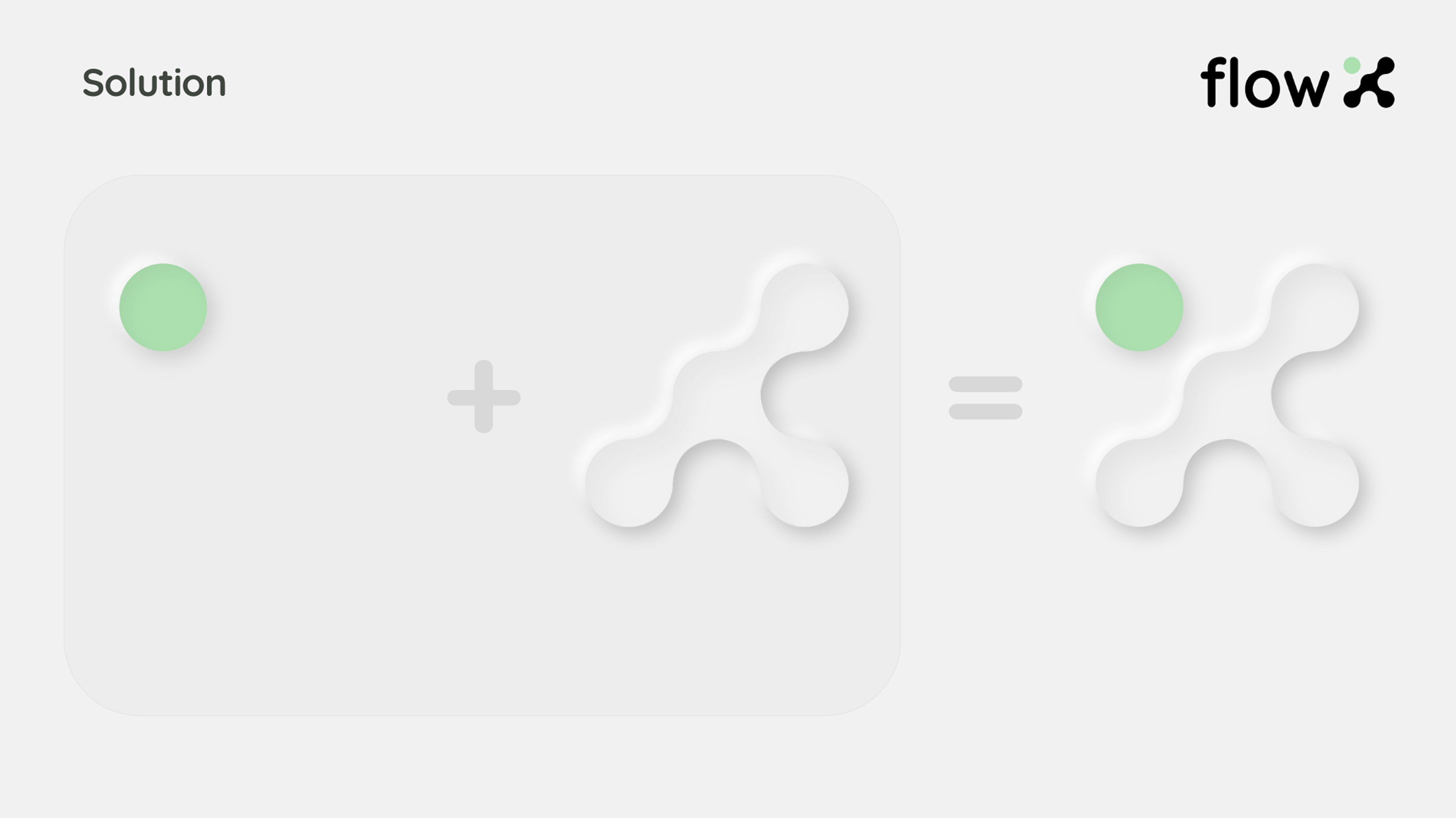
Using the logo as a visual explanation tool. The X structure shows how energy flows combine within the system - turning the brand mark into a functional diagram. Complex technology becomes simple and clear through visual storytelling.